Adjusting the width of your WordPress blog can significantly impact its readability, design, and overall user experience. From theme settings to custom CSS, there are various methods you can use to control your blog’s width to make it visually appealing and functional across different devices.
This guide covers all the essentials for changing blog width on WordPress, providing options suitable for beginners and advanced users alike.
Why Blog Width Matters on WordPress
Changing the width of your blog isn’t just a cosmetic adjustment—it affects how readers engage with your content. Properly optimized width can make content easier to read, prevent distractions, and create a balanced layout. On smaller screens, adjusting width also improves mobile responsiveness, ensuring readers on tablets and smartphones have a smooth browsing experience.
Whether you want a full-width layout, narrower content area, or a specific sidebar width, understanding how width influences design and functionality is the first step toward creating a user-friendly blog.
What is Blog Width in WordPress and Why It’s Important
In WordPress, “blog width” generally refers to the width of the main content area, but it can also include sidebar width and the overall page layout. By adjusting the width, you can:
- Improve readability by controlling how much text appears on each line.
- Create layout balance between the content and sidebars.
- Enhance user engagement by creating a visually appealing structure.
For a desktop view, a wider blog layout may look better, while on mobile devices, responsive widths are essential. Understanding how width contributes to overall blog structure helps you decide which adjustments best fit your design goals.
Method 1. Changing Blog Width Using Theme Settings

Some WordPress themes offer built-in options to adjust the width of your content area without needing code. Here’s how to explore this option:
- Access Theme Customizer Settings
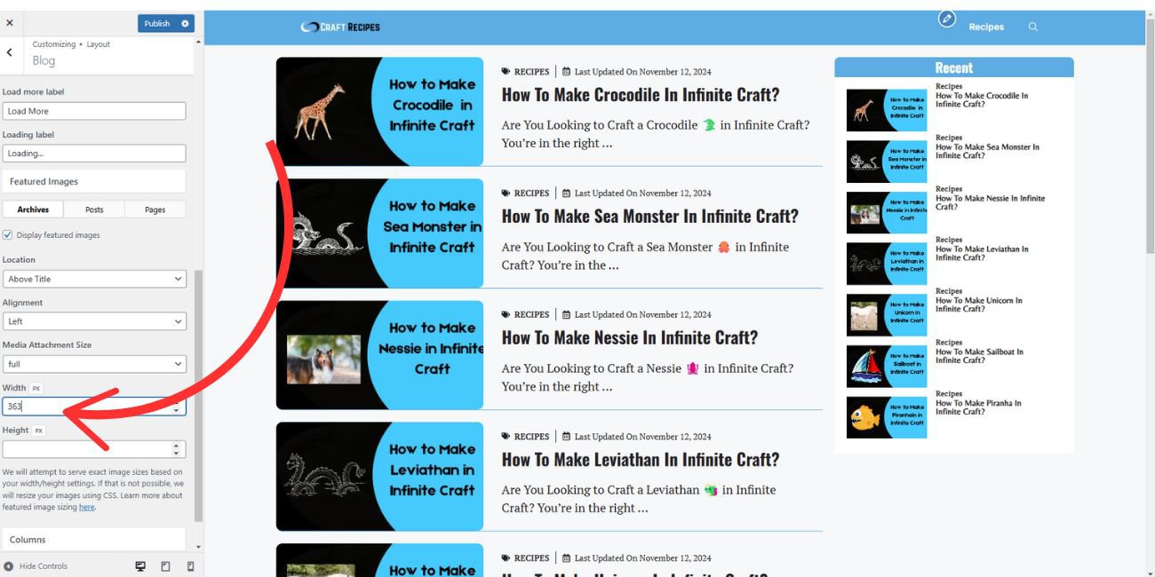
- In your WordPress dashboard, go to Appearance > Customize. Look for sections like Layout or Content Width. If your theme supports this, you should see options that let you modify the width directly.
- Adjust Width Settings
- In themes with a layout option, you may be able to control specific content areas (like blog pages) separately from other sections of your site. Adjust the width settings as desired, then save and preview to check the results.
Popular themes like Astra and Divi often include these customizable layout options. If you’re unsure if your theme has this feature, check the theme’s documentation, as it can vary.
Method 2. Top Plugins to Change Blog Width in WordPress
If your theme doesn’t offer sufficient width customization, plugins can provide additional options. Here are some popular plugins that enable width adjustments:
- Elementor: As a drag-and-drop page builder, Elementor allows users to create custom layouts with adjustable content widths. It provides flexibility to create unique page designs.
- WP Page Builder: Another visual editor that lets users control the width of individual elements within a post or page, making it suitable for those looking for more layout customization.
- Simple Custom CSS: This plugin allows users to add custom CSS for specific width adjustments, offering more precision over blog layout.
Each of these plugins offers an easy way to adjust width without altering theme files, providing more flexibility than basic theme settings.
Method 3. Adjusting Blog Width with Custom CSS in WordPress

For those comfortable with coding, custom CSS provides complete control over your blog’s width. Custom CSS allows you to set exact pixel or percentage widths for different elements, such as the content area and sidebar.
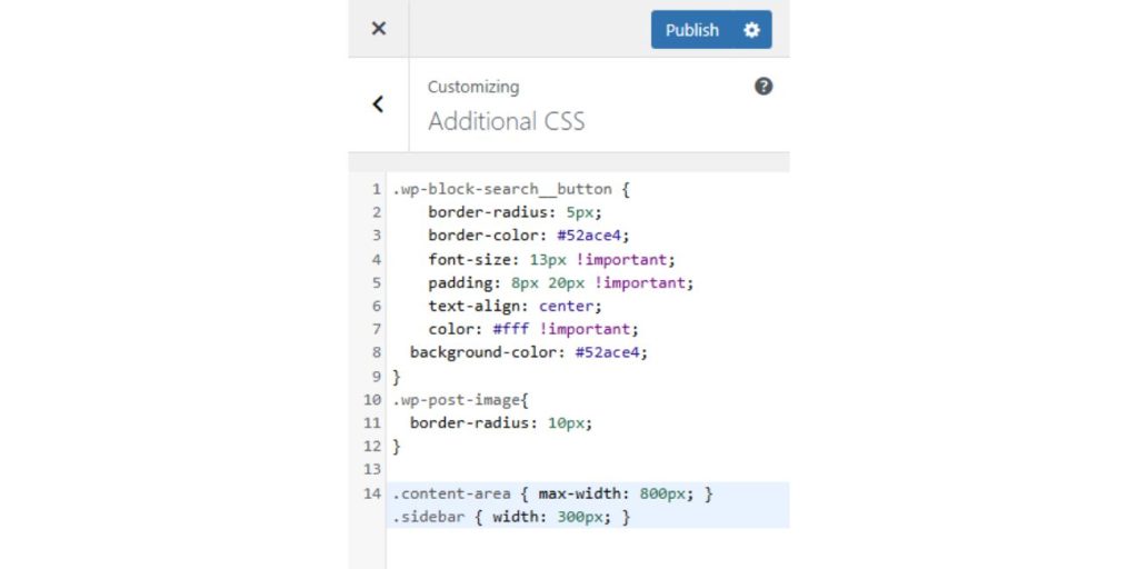
- Go to Appearance > Customize > Additional CSS in your WordPress dashboard.
- To adjust the content width, you can add CSS like:
- Once you’ve entered the code, save changes and use the preview mode to see how it appears on different screens.
Custom CSS is particularly useful for advanced users looking to make precise adjustments. It allows for more tailored control but requires basic CSS knowledge.
Method 4. Changing Blog Width with a Child Theme (Advanced Option)
For those looking to customize theme files directly, using a child theme provides a safe way to make changes without affecting the original theme files.
- Creating a Child Theme
- A child theme is essentially a copy of your theme that allows for edits without losing changes during theme updates. You can create a child theme manually by following WordPress’s documentation or by using a plugin like Child Theme Configurator.
- Editing the Child Theme’s style.css File
- In your child theme folder, open the
style.cssfile. Add the same CSS code used above to adjust your blog width: - After saving, activate the child theme in your WordPress dashboard to apply the changes.
- In your child theme folder, open the
While this approach offers full customization, it’s best suited for users comfortable with coding.
Method 5. Using Page Builder Plugins to Adjust Blog Width
If you’re using a page builder plugin like Elementor or WPBakery, adjusting blog width may be even easier, as these tools often include custom layout settings.
- Use Page Builder Layout Options
- In the page builder, open the blog page or template you’re editing. Look for layout settings that allow you to control content width or column width directly within the editor.
- Customize Width for Responsive Layouts
- Page builders often include options for different screen sizes, so you can set custom widths for desktop, tablet, and mobile devices to create a responsive layout.
While some page builder plugins have free versions, premium versions typically offer more control over layout customization, including width settings.
Best Practices for Mobile-Friendly Blog Widths
Finding the ideal width often requires balancing readability with aesthetic appeal. Many designers recommend a blog width between 600px and 800px for text-heavy content, as this width keeps lines of text from stretching too wide across the screen, making it easier to read. Experimenting with slightly narrower or wider settings can help you find the perfect look for your unique content and audience.
If you’re using a wider layout, consider adding a background color or subtle border around the content area to visually define the boundaries of your posts. This can help create a clean, organized look that’s appealing and easier to read.
Tips for Testing and Previewing Blog Width Changes
Testing your layout adjustments is key to ensuring consistency across devices. Here are some methods for testing blog width changes effectively:
- Preview in Customizer: Use the WordPress Customizer’s preview mode to check how your blog appears on desktop, tablet, and mobile views.
- Test on Multiple Devices: Whenever possible, view your blog on actual devices to confirm that the layout looks good on different screens.
- Clear Browser Cache: After making CSS or theme adjustments, refresh your browser cache to see the latest changes.
Testing helps maintain a cohesive look and ensures that your blog width adjustments provide a seamless experience for all users.
Common Blog Width Issues and How to Fix Them
Sometimes, adjusting width can lead to unexpected issues, like misaligned content or layout shifts. Here’s how to resolve some common width-related problems:
- Content Overflow: If content spills out of the designated width, check your CSS settings and ensure elements have defined widths.
- Sidebar Alignment Issues: If the sidebar doesn’t align as expected, inspect the sidebar width settings and ensure there’s enough space for content on both sides.
- Layout Shifts: In cases where plugins or themes interfere with layout, use WordPress’s Inspect Element tool to pinpoint CSS conflicts or plugin-related issues.
Troubleshooting width issues helps maintain a clean, organized layout and provides a better experience for your readers.
Conclusion
Changing your blog’s width on WordPress offers numerous benefits, from enhancing readability to creating a balanced layout. Whether you use theme settings, plugins, or custom CSS, each method provides a solution for different skill levels and needs. Testing for responsive design and resolving any width-related issues are also key to achieving a professional-looking blog.
Start with basic adjustments in theme settings or plugins, and explore custom CSS or child themes for more advanced customizations. By following these best practices, you can create a visually appealing blog that’s user-friendly and optimized for any screen size. Feel free to comment if you have questions or share this guide with others looking to refine their WordPress blog layout.

