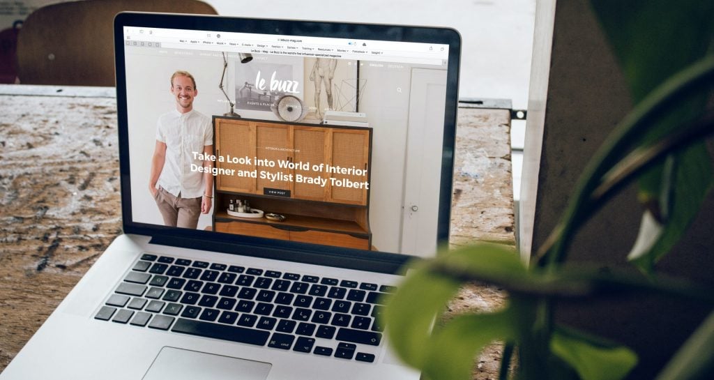
Many of us may think that a website holds little importance in the promotion and mass adoption of a business. This is not true at all. A website is the first impression of how your business performs. As the first impression is often the last impression, it is essential to pay attention to it. Attractive website design may hold users to at least see what you are offering.
When you have a larger number of people on your #website staying for a while, it is very likely that you will lure the Share on XTherefore, it is important to design an attractive and, most importantly, user-friendly website. It is surprising to know that website design plays a significant role in convincing customers to trust a business. A website with a good and easy-to-understand interface gets ranked quickly and thus generates more valuable traffic.
This, in turn, leads to more conversions. You can be as creative with your website as you can, but it is important to follow some rules, such as sticking to the ADA guidelines compliance checklist for websites. It is better to follow these guidelines to create a website that covers the needs of a wider audience.
An attractive website wins users’ trust
It is important to understand that website designing has shifted from popping, glittery, complicated designs to somewhat simpler websites. Website developers are advised to design a website keeping in view the ADA web compliance terms and conditions. These websites are purpose-oriented and are easy to navigate from the users’ perspective.
A website that focuses on essentials rather than on bells and whistles creates the impression that a business is work-oriented and is professional enough to understand the needs of its user. Clean, elegant layouts and easy-to-navigate websites make it easy for the website to load and save users precious time. It keeps them hooked on the website. Otherwise, the users may get frustrated easily.
In addition to that, it is seen that easy and simple websites have the potential of holding users for longer. If a user found your website to be too complicated to understand, they would not be able to stay for longer, even if they want to. Especially when your menus are clear and to the point, a user feels very comfortable surfing on the website.
Another important thing is straightforward call-to-action phrases. Your users should clearly know what they are here for. You may call them out to sign up for various benefits or to subscribe to the newsletter notifications. Moreover, you can call them to donate for a good cause or anything else related to your business.
Manage your website to increase its readability and better understanding
With websites, less is more, so you have to upload only what is necessary. Cluttering your website with extra non-essential information will confuse the users. If you are adding information, try to break it into small paragraphs, leave small empty spaces between two different categories, or divide your content into different pages.
With pop-ups and images, you can both direct and confuse the customers. Therefore use these resources wisely and in a sleek manner. Keeping that in mind, there are cases of ADA website lawsuits, so it’s good to be thoughtful and consider different types of users while choosing colors, layout, and fonts. The website should be more inclusive and accessible for everyone who reaches it.
In addition to that, fonts also play an important role in understanding the content. Using balanced fonts and the right font size for headings and the content is a way of making your website more clear and intriguing. Videos, in addition to images, can also be used to explain your services or products in a better way.
People often take more interest in listening to tutorials and watching videos rather than reading long articles. According to researchers, videos on landing pages can increase the conversion rate by up to 80%. Using scalable images makes sure that the users enjoy a high-quality experience on both mobile and desktop.
Design the website to be more user friendly
Not all of your users will be working on desktops; therefore, designing a website that is user-friendly in all ways is very important. A website should be pocket-friendly, which means everyone, even in a hurry, can get the extract of it.
It is good to spread your information for better readability and appearance, but sometimes, when the information is too scattered and the user has to navigate through a lot of pages, there is a great deal that may leave out of frustration and annoyance. Therefore, it is crucial to streamline all the information.
Researchers suggest that about 40% of individuals leave the website after seeing the first page. Therefore, your first page should be planned strategically. No one wants to hunt for information, especially on a website. As discussed earlier, a clear call to action makes it a lot easier for a user to find something of their liking and relevant on the website.
Users often go directly to the search box when looking for something, and therefore your search should be fast, robust, competitive, and programmed properly. This is, in a way, your last chance of retaining the customer because most customers resort to searching when they are done trying to scroll.
If they do not find what they are looking for through the search option, they will definitely not stay any longer. This is why developers should keep this in mind while formatting the website.
Conclusion
With increasing digitization, websites play an imminent role in increasing the revenue of businesses. A website is a business’s first impression. Purposefully and strategically planned websites have greater chances of getting conversions rather than flashy and complicated websites.
A website should be simple yet not boring; it should look professional but should not lack important information. It should be more accessible for everyone. An attractive website, in short, is a key to getting more customers and clients.


